
BONFIRES VERSION 1
EP Design
Artist
Spreaders


Bonfires was a fun project - the idea was to produce a general visual strategy for the band Spreaders, that could evolve over time, and to demonstrate its use.
I also wanted to use my own pictures in my designs, in order to experiment with them in ways I wouldn’t allow as a photographer, but that could be fun as a designer.
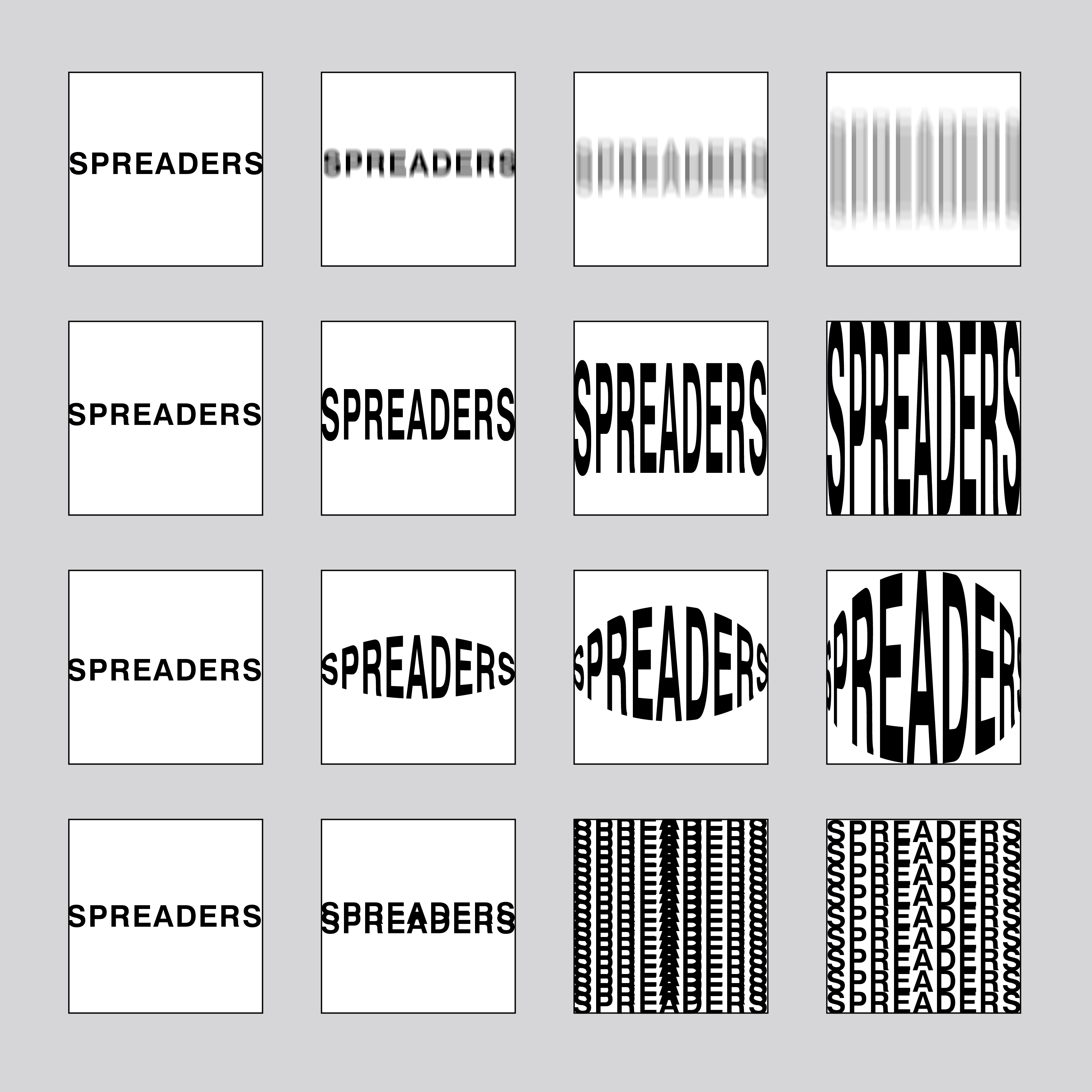
I thought the band’s name was rather odd, and that it could be a lot of fun to take it litterally as a base for graphic projects. I loved the idea of building a complex system on a silly idea.
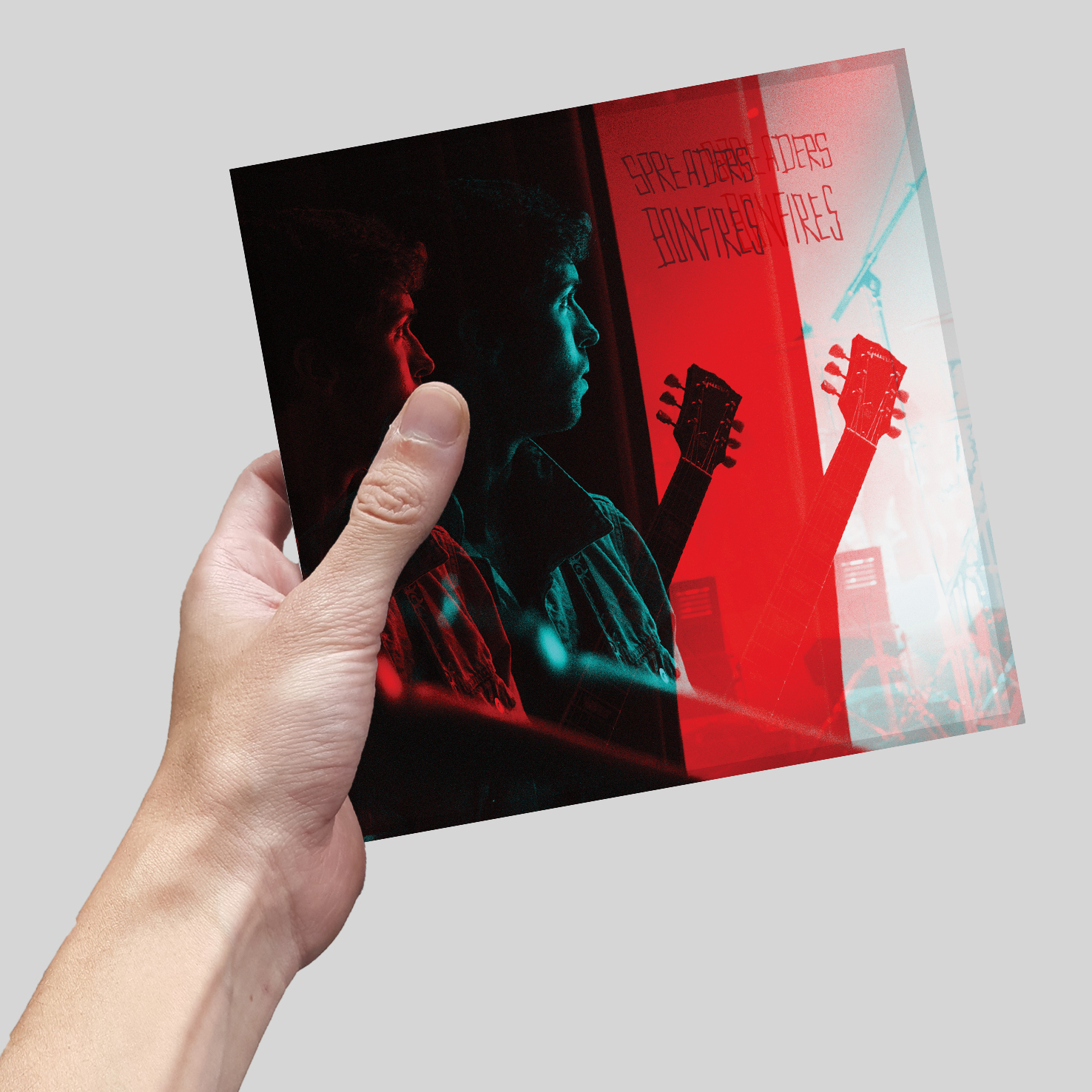
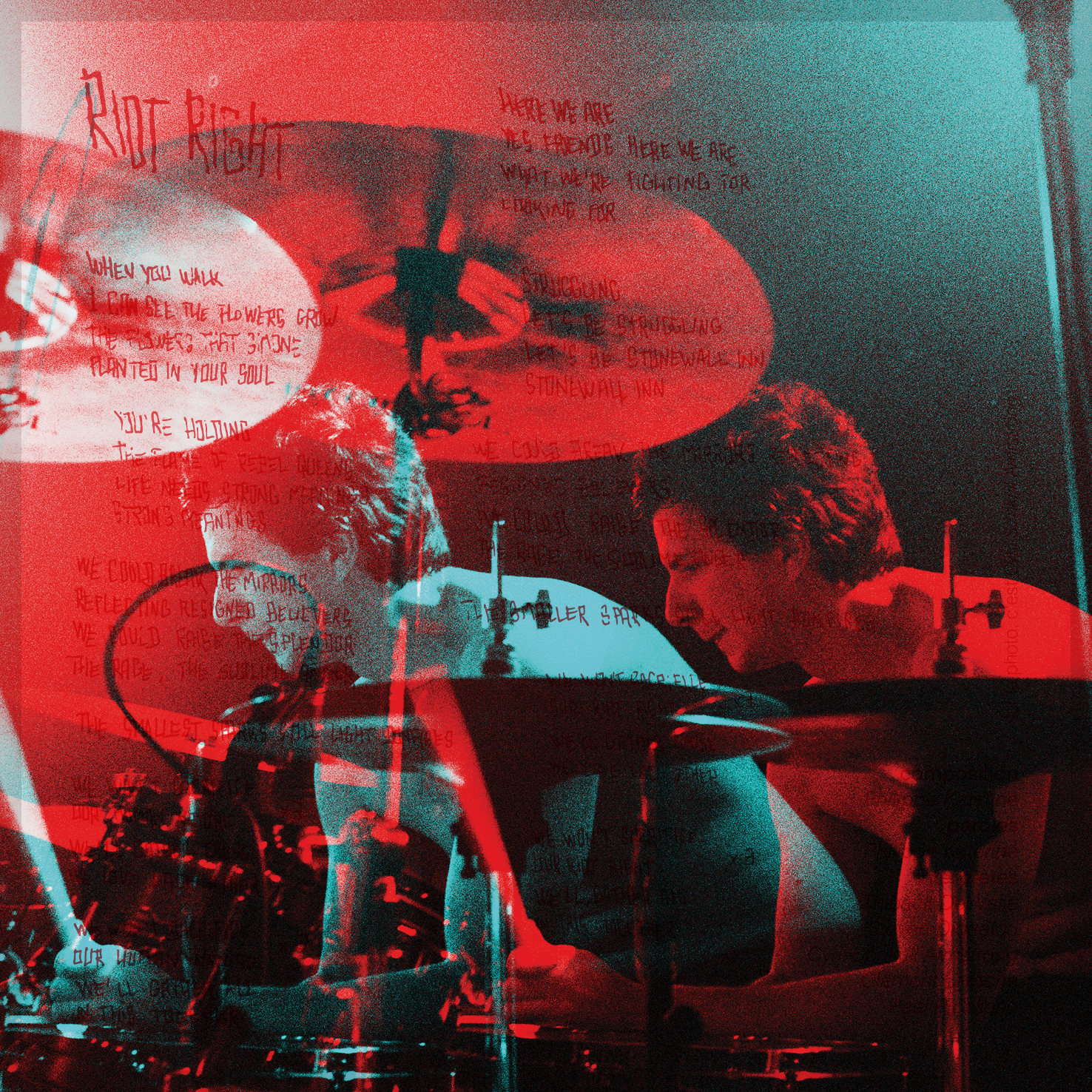
So I took my black and white photographs of their concerts, alterated them and litterally spread the layers obtained to dissociate them in an echo of themselves.
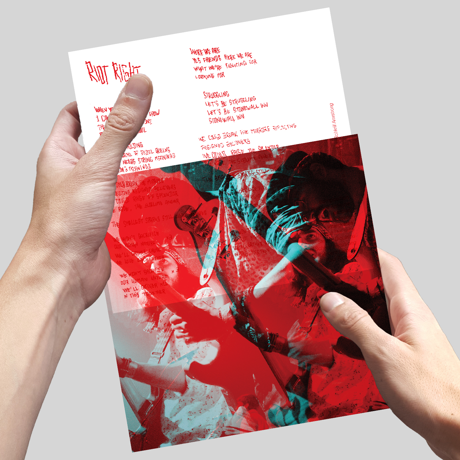
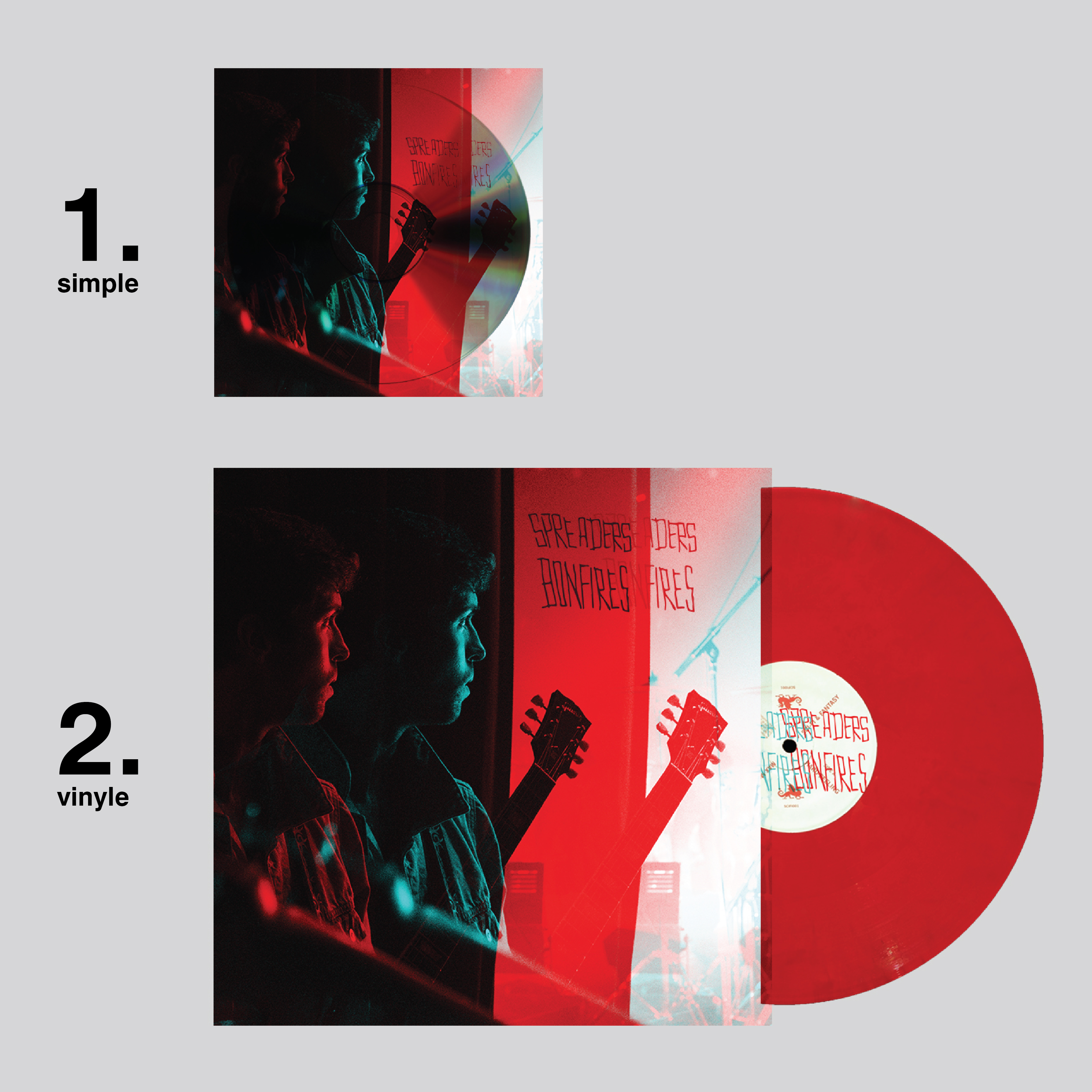
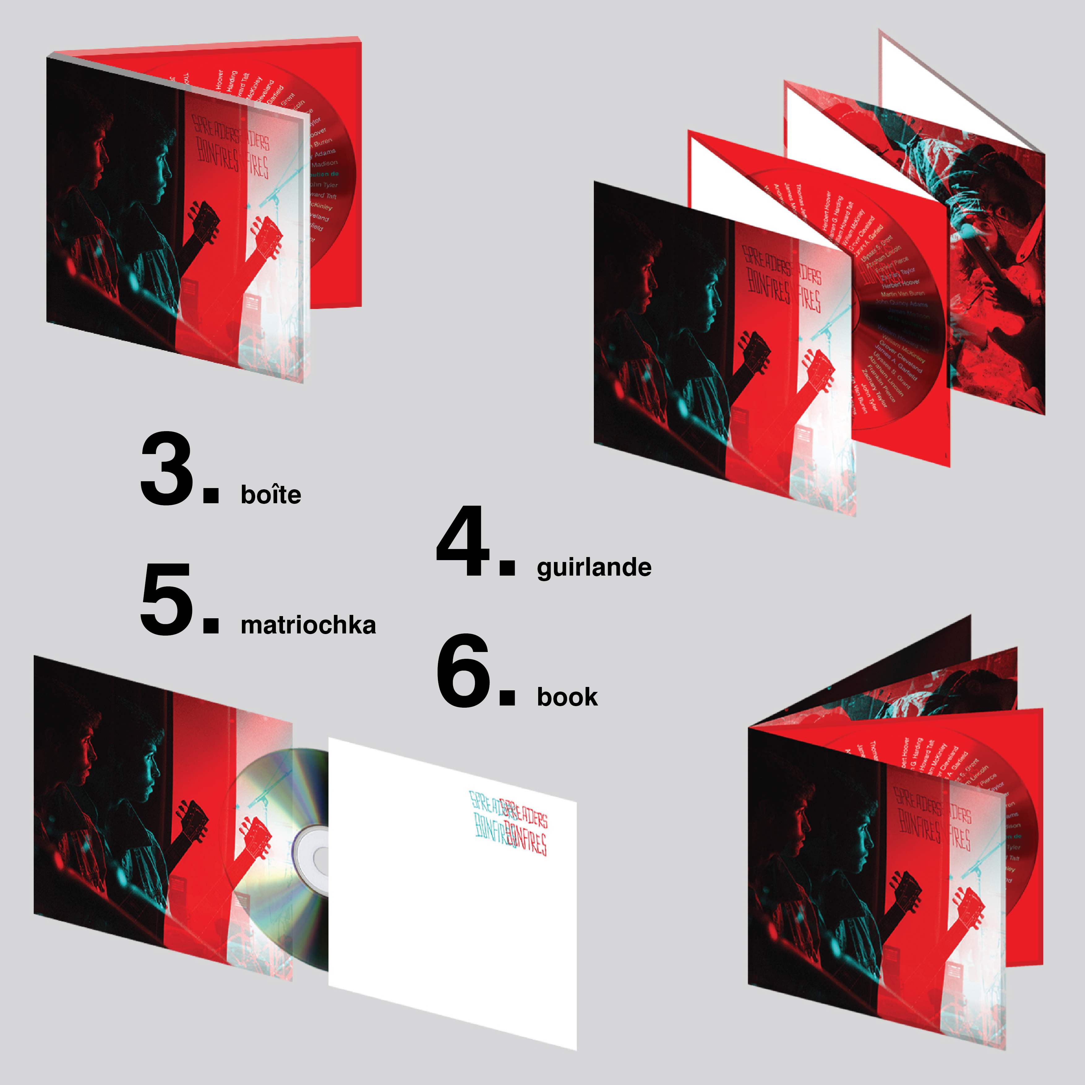
A simple process which could allow for another simple idea : Using the bicolored layout to hide and reveal cards within, showing the lyrics to the songs. So you could see the lyrics through the pictures, in subtle ways, and when removing the card, the superposition effect would activate the graphics through movement.
I simply wanted to make a EP that doesn’t look like a EP at all. It is more of a strangely graphic laporello, an art piece which happens to contain a CD.
I also wanted to use my own pictures in my designs, in order to experiment with them in ways I wouldn’t allow as a photographer, but that could be fun as a designer.
I thought the band’s name was rather odd, and that it could be a lot of fun to take it litterally as a base for graphic projects. I loved the idea of building a complex system on a silly idea.
So I took my black and white photographs of their concerts, alterated them and litterally spread the layers obtained to dissociate them in an echo of themselves.
A simple process which could allow for another simple idea : Using the bicolored layout to hide and reveal cards within, showing the lyrics to the songs. So you could see the lyrics through the pictures, in subtle ways, and when removing the card, the superposition effect would activate the graphics through movement.
I simply wanted to make a EP that doesn’t look like a EP at all. It is more of a strangely graphic laporello, an art piece which happens to contain a CD.
BONFIRES VERSION 2
EP Design
Artist
Spreaders


In the end, the band saw my first proposal as overcomplicated. You have to adapt to the client.
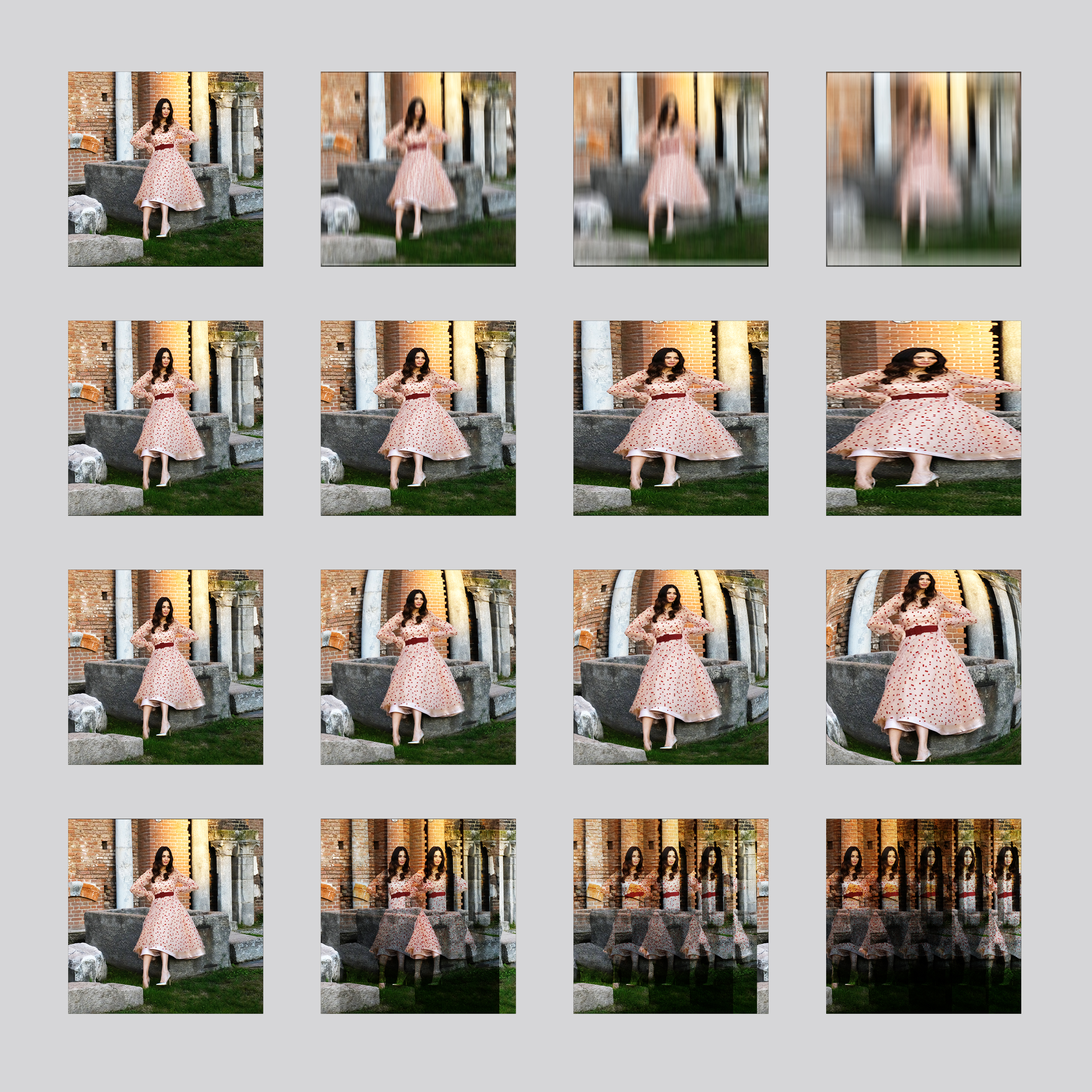
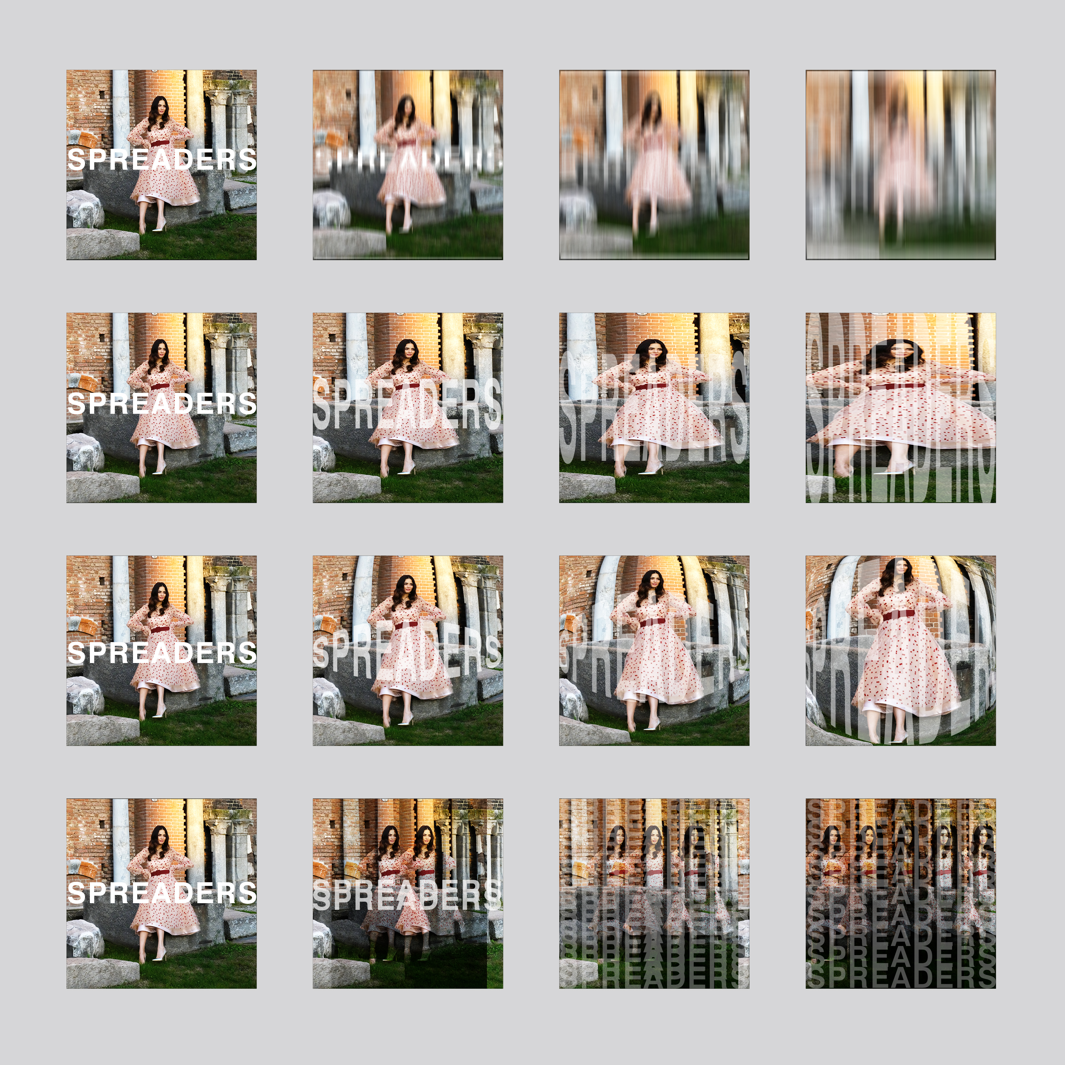
So I devised another strategy based on the same ideas, using the silly idea of the spread as a base, and finding a way to use my own pictures.
Since I had spent time writing the lyrics over and over when developing the tortured handwriting in the previous version, I knew the texts pretty well. Themes came back between songs. A spirit of revolt, but also a desire for some kind of transcendant revelation, a calm within.
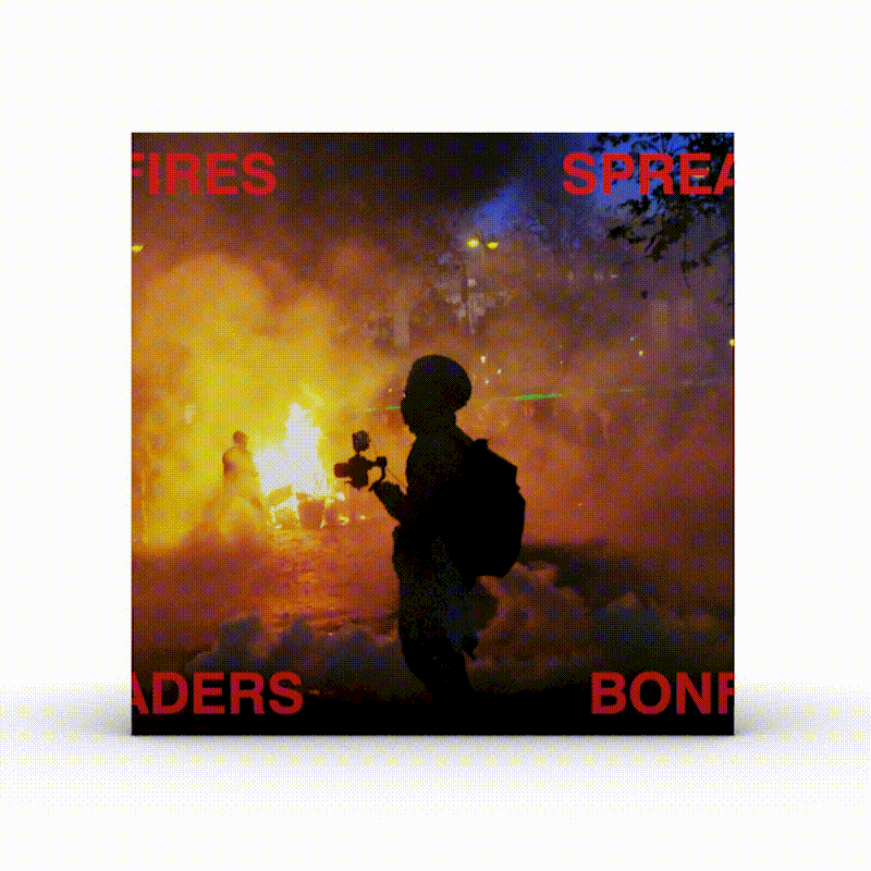
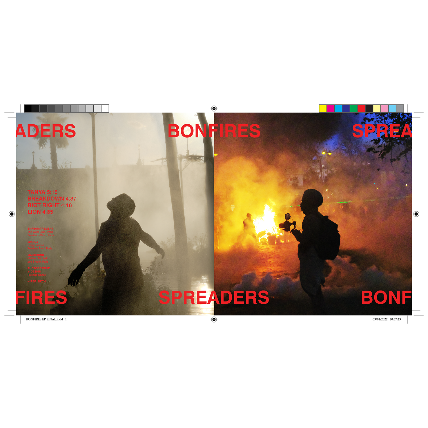
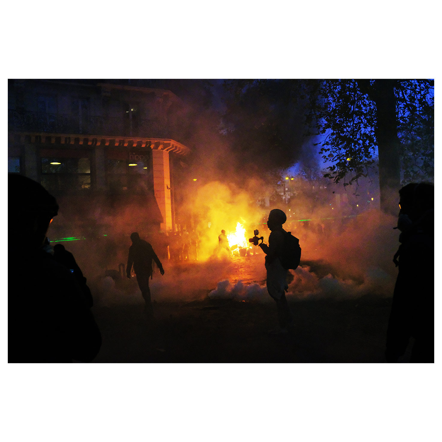
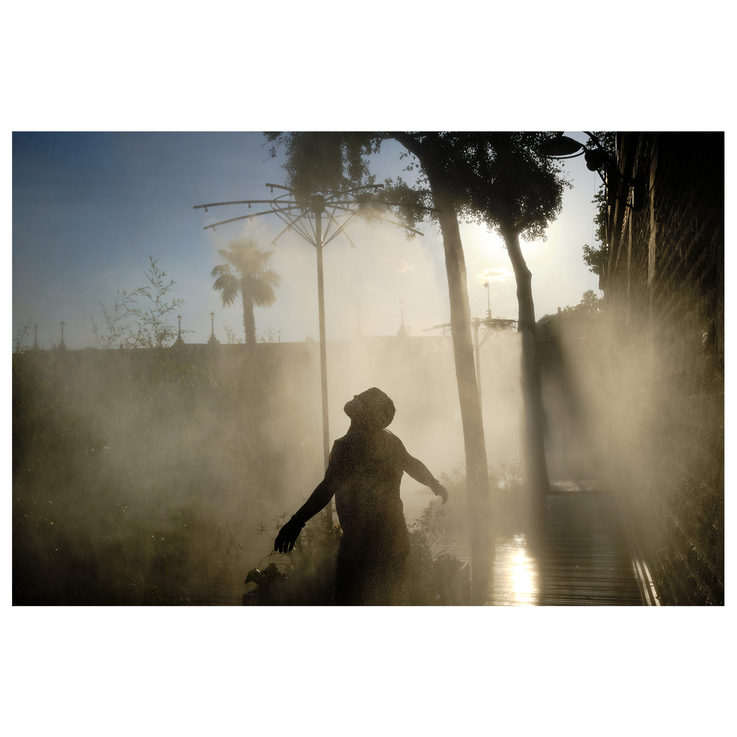
I chose two photographs which could work as a diptych, making each side of the EP represent the two sides of the lyrics. The text, showing the band’s name and the EP’s name, was the link between the two sides, litterally spreading accross the fold.
This is the design the band went for in the end. I personally liked the other one better. I’d love an occasion to make that idea work.
So I devised another strategy based on the same ideas, using the silly idea of the spread as a base, and finding a way to use my own pictures.
Since I had spent time writing the lyrics over and over when developing the tortured handwriting in the previous version, I knew the texts pretty well. Themes came back between songs. A spirit of revolt, but also a desire for some kind of transcendant revelation, a calm within.
I chose two photographs which could work as a diptych, making each side of the EP represent the two sides of the lyrics. The text, showing the band’s name and the EP’s name, was the link between the two sides, litterally spreading accross the fold.
This is the design the band went for in the end. I personally liked the other one better. I’d love an occasion to make that idea work.